
The software that this manual describes has been written in accordance with the following documents:
The system is comprised of a series of modules (also known as components, programs, scripts, transactions, tasks, units of work, etc) each of which performs a single logical function. A module may access zero, one or more database tables - whatever is necessary to achieve its function.
Where an entity (database table) requires functions to List, Select, Create, Read, Update and Delete occurrences (rows) each of these functions will be provided in a separate module rather than being combined into a single module that can perform all of these functions. The logic behind this philosophy is discussed in a separate document titled Component Design - Large and Complex vs. Small and Simple.
The end result is a system which is comprised of a large number of small, simple components rather than a small number of large, complex ones. Components which access the same entity (database table) will share the same object which deals with that entity. They may also share the same screen structure.
Experienced developers, those who have worked on systems containing many modules, should recognise that all modules can be categorised in the following ways:
Many components perform the same operation but on a different entity (database table). The structure and behaviour are the same, it is just the content which is different. In order to provide rapid application development by maximising the number of reusable components I have created a series of patterns or templates which are based on a particular combination of structure and behaviour. These are documented in Transaction Patterns for Web Applications.
Each screen is comprised of a set of standard elements, and each of these elements performs a particular function. Having encountered one of these elements in one screen the user should have no difficulty in recognising and using the same element in another screen. This helps to promote a common 'look and feel' with all components within the application. These elements are listed below.
Menu Bar with text links

There is the option to change the text into images, as in the following:
Menu Bar with image links
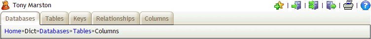
This appears at the top of each page. It provides a means of navigating around the various components within the application with each option appearing in its own tab. It is constructed from the contents of the MENU table after filtering out those entries which do not also exist on the ROLE-TASK table for the current User's ROLE. The labels will be taken from the Task's button text field, as shown in Update Task. Alternative descriptions in a supported foreign language can be defined on the MNU_TASK_ALT table.
Below the line of menu tabs is the "breadcrumbs" area which shows the list of tasks through which the user navigated in order to get to the current page. As each new task is selected it will be added to the list. When a task is terminated it will be removed from this list. An item in this list will be available as a hyperlink if it is different from the current page.
It is described in more detail here.
This appears immediately below the menu bar and identifies the function of the component. It is taken from the Task's description field, as shown in Update Task. Alternative descriptions in a supported foreign language can be defined on the MNU_TASK_ALT table.
In some cases the title area may also contain a QuickSearch Bar, as shown in the following:
This is described in more detail here.
This appears near the top of each page, but is entirely optional. It provides a means of navigating to child tasks which are related to the current task. It is constructed from the contents of the NAVIGATION BUTTON table after filtering out those entries which do not also exist on the ROLE-TASK table for the current User's ROLE. The labels will be taken from the Task's button text field, as shown in Update Task.
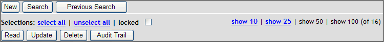
Buttons on the bottom row require one or more entries within the screen to be selected so that their details can be passed down, as described in Appendix I.
It has three rows which are described in more detail here.
Where the data area contains multiple rows of data arranged horizontally across the page there will be the need for a set of headings above the columns of data. These are described in more detail here.
This area may contain data from a single occurrence (row) of data, in which case it will be arranged vertically, one field per line with labels to the left. If the data comes from multiple occurrences it will be arranged horizontally, one occurrence per line with column labels at the top. This is described in more detail here.
Where a screen contains multiple occurrences from a database table there is a limit to the number that may appear in a single page. This area will show how many pages of data are available and will provide links to enable the user to move backwards or forwards through those pages. This is described in more detail here.
There are two display options which are available, governed by the Pagination Width setting on the Menu Control Record. If this value is zero then the default display will be used.
Default display
If the value is greater than zero then a 'Google style' display will be used.
Google Style
Where a screen contains a single occurrence from a database table there may be several occurrences available (for example, as selected in the previous function). This area will show how many items (occurrences) are available and will provide links to enable the user to move backwards or forwards through those items. This is described in more detail here.
There are two display options which are available, governed by the Scrolling Width setting on the Menu Control Record. If this value is zero then the default display will be used.
Default display
If the value is greater than zero then a 'Google style' display will be used.
Google Style
This appears at the bottom of each page and contains buttons which allow the user to select a particular action such as SUBMIT (apply changes to the database) or CANCEL (do not apply changes to the database). This is described in more detail here.
All HTML output is generated by XSL transformations which use dynamic XML files and static XSL stylesheets and templates. The XML files are dynamic as they are created at run-time by each component using data obtained from the database. The XSL stylesheets and templates are static as they are pre-defined and do not change at run-time. An XSL stylesheet contains all the instructions necessary to construct a single HTML document from the data provided in an XML document. An XSL template (analagous to a subroutine) contains instructions that deal with a specific part of a document. A stylesheet may use any number of templates, and a template may be used by any number of stylesheets. This provides a great deal of reusability and consistency, as described in Reusable XSL Stylesheets and Templates.
Where a module has dialog with the user this will be achieved in a single screen (also known as a form, page or HTML document). The layout of each screen is defined using the following:
The modules which deal with the Select, Create, Read, Update and Delete functions all share a common DETAIL stylesheet. There is a separate stylesheet for LIST screens.
Those modules which deal with the same entity (database table) will also share a common structure file. The stylesheet will make these fields amendable or read-only as appropriate.
A feature of HTML documents (web pages) is that the visual presentation of each page can be altered quite easily. By 'visual presentation' I mean any of the following:
Although it is possible to include all style specifications within an HTML document it is not considered to be good practice. The most efficient method is to extract all style specifications and keep them in a separate Cascading Style Sheet (CSS) file or files. In this way it is possible to update the contents of a single CSS file and have that change automatically inherited by all pages which reference that CSS file. Without the use of a CSS file it would be necessary up update each page individually, which on a large site with numerous components could be a long and laborious process.
The term 'cascading' means that an HTML document can actually refer to a series of CSS files. These files will be scanned in the order in which they were defined and their contents merged so that a single specification is the result. In my infrastructure I make use of the following CSS files: